

The metro tile is one of the few objects in domestic design that has remained genuinely relevant across more than a century of changing taste. Developed for the Paris Métro at the turn of the twentieth century, adopted by New York’s subway system, imported into British bathrooms, kitchens, and pub interiors through the early and mid twentieth century, and still appearing on specification sheets across the UK in 2026 — the metro tile has outlasted every trend that has tried to replace it.
What’s changed is not the tile. The classic 75×150mm rectangular ceramic with its bevelled edge and gloss glaze has remained fundamentally unchanged. What’s changed is the colour conversation surrounding it. For much of the past three decades, metro bathroom tiles meant white — bright white, off-white, or occasionally cream. That default position has shifted. Coloured metro tiles in sage, navy, dusty rose, deep teal, charcoal, and warm terracotta are now specified with the same confidence as the classic white, and the results, when handled correctly, are producing some of the most characterful UK bathroom interiors of the current design period.
Understanding what drives the choice between classic white and modern colour is the more useful question than simply picking a preference.
Why Classic White Metro Tiles Remain the Benchmark
White metro bathroom tiles have maintained their position not through inertia but through consistent, demonstrable performance across a wide range of UK property types, design objectives, and homeowner priorities.
Light reflection in limited natural light. The gloss glaze of a classic white metro tile reflects light efficiently — particularly valuable in the significant proportion of UK bathrooms that face north, east, or have no window at all. Where pale stone-effect or matte tiles absorb limited daylight, white gloss metro bounces it around the room, maintaining a sense of brightness that warmer, deeper tile colours cannot match under the same conditions.
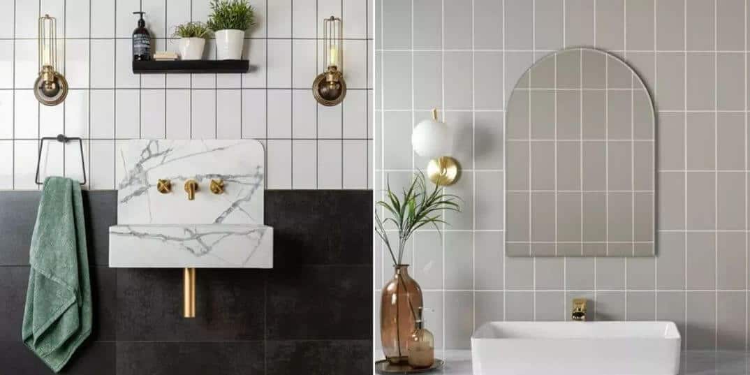
Architectural versatility. White metro tiles sit comfortably in Victorian terraces, Edwardian semis, contemporary new-builds, and converted industrial spaces without requiring any design justification. The tile’s period credentials make it appropriate in older properties; its geometric simplicity makes it appropriate in modern ones. Very few tile choices span that range with the same ease.
Grout flexibility. The grout decision with white metro tiles changes the character of the finished wall substantially, and this flexibility is part of the tile’s enduring appeal. Dark grey or charcoal grout with white metro creates a strong graphic grid — the version most associated with New York diner and London pub aesthetics. White or cream grout with white metro produces a quieter, more continuous surface. Neither is wrong; both are deliberate. The tile accommodates both decisions without objection.
Resale neutrality. For UK homeowners considering property appeal alongside personal taste, white metro bathroom tiles occupy the safest possible position — widely appealing, broadly familiar, and unlikely to be cited as a reason a buyer hesitates. In a property market where bathroom condition influences valuations meaningfully, this neutrality has real commercial value.
The Case for Coloured Metro Tiles
Coloured metro bathroom tiles are not a new idea. Glazed ceramic tiles in deep greens, blues, and earthy tones appeared in Victorian and Edwardian interiors long before the white metro became the default. What feels new is the confidence with which colour is being reapplied to this format in 2026 — and the quality of the coloured metro products now available from UK suppliers.
Sage and soft green. The strongest coloured metro tile performer in the current UK market. Sage metro tiles in a standard 75×150mm or elongated 100×300mm format bring warmth and organic quality to bathroom walls in a way that white cannot, and they suit the widest range of UK property types — from Victorian terraced bathrooms with original cast-iron baths to contemporary extensions with oak vanity units and warm lighting. The undertone within the sage glaze matters considerably: a grey-sage reads cooler and more architectural; a yellow-sage reads warmer and more botanical. Order samples of both before committing.
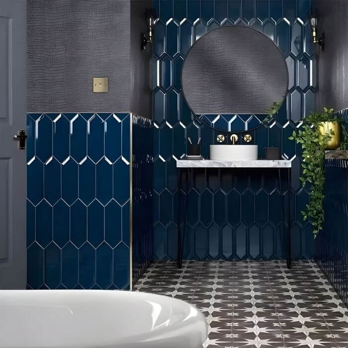
Deep teal and navy. At the more committed end of the coloured metro tile spectrum, deep teal and navy produce bathroom walls with genuine depth and colour presence. Used floor-to-ceiling in a compact cloakroom or en suite, these shades create an immersive quality that white simply cannot achieve — the bathroom feels designed around a specific intention rather than defaulted to safety. The glaze on a good quality coloured metro tile in these shades shifts between more and less saturated depending on lighting angle, producing the kind of surface interest that flat large-format tiles in equivalent colours do not generate.
Dusty rose and warm terracotta. Two shades occupying the warmer, more organic end of the coloured metro palette, and both performing consistently well against the backdrop of UK interior design’s broader move toward earthy, warm neutrals. Dusty rose metro tiles suit bathroom schemes that prioritise warmth and softness — frequently specified with brushed brass hardware and warm timber accessories in a combination that photographs well and lives well across seasons. Terracotta metro, with its reference to fired clay and Mediterranean tile traditions, brings outdoor warmth inside in a way that feels genuinely considered rather than decorated.
Charcoal and slate. Dark coloured metro bathroom tiles occupy the same specification territory as dark bathroom tiles generally — they reward commitment and repay proper lighting. A charcoal metro tile on all four walls of a small bathroom with well-planned artificial lighting produces an atmospheric, confident result. Half-hearted application — one dark wall, three white — tends to read as underresolved. If you’re specifying dark metro tiles, take them all the way.
Layout: Where the Design Decisions Really Live
The format choice — white or coloured — is only one dimension of a metro bathroom tile specification. The laying pattern is equally consequential, and the two decisions interact.
Horizontal brick bond. The most historically authentic and widely specified metro tile layout. Alternating rows offset by half a tile length, running horizontally. In white metro tiles, this layout reads as classic and composed. In a coloured metro tile, the horizontal emphasis can make a bathroom feel wider, which is useful in narrow galley bathrooms common in UK terraced houses.
Vertical stack (stacked bond). All joints, horizontal and vertical, fully aligned. Produces a more graphic, architecturally precise quality than brick bond and suits contemporary bathroom schemes where the metro tile is being used for its geometric clarity rather than its period references. Requires precise installation — any misalignment is immediately visible in a stacked pattern.
Vertical brick bond. The same brick offset as horizontal, but rotated 90 degrees so the tiles run vertically and the offset joints read horizontally. This layout draws the eye upward — the most effective single laying decision for increasing the perceived ceiling height in low-ceiling UK bathrooms. Particularly effective in new-build properties where 2.2–2.4m ceiling heights are standard.
Herringbone. The most decorative metro tile layout and the one that introduces the most visual movement. In white metro tiles, herringbone reads as energetic but controlled. In a coloured metro tile — particularly sage or teal — the herringbone pattern adds another layer of visual complexity that can enrich a scheme or overwhelm it depending on the room’s other elements. Use on one surface only; herringbone on all four walls and the floor simultaneously is too much.
Grout Colour: The Decision That Defines the Finished Wall
The grout specification for metro bathroom tiles — regardless of whether the tile is white or coloured — is a primary design decision that changes the character of the finished wall as significantly as the tile colour itself.
With white metro tiles, the three most commonly specified grout choices produce distinctly different results. White grout creates a near-continuous surface with subtle joint definition — the quietest, most refined version of the white metro wall. Mid-grey grout creates the classic graphic grid that references London pub and New York diner aesthetics. Dark charcoal or black grout produces maximum contrast — the most graphic and most contemporary of the three options.
With coloured metro tiles, tone-matched grout is the approach that allows the tile colour to do its fullest work. A sage metro tile with a warm mid-green grout reads as a cohesive, continuous coloured surface. The same sage tile with a white grout produces a two-colour scheme where the grid pattern competes with the tile colour for visual attention. Both are valid decisions — but they produce fundamentally different rooms, and the choice should be made deliberately rather than by default.
One practical note: in hard-water areas across much of England, white and pale grout with white metro tiles requires more maintenance attention than mid-tone grout. Limescale and soap residue are most visible against white grout — a darker mid-grey joint is marginally more forgiving in daily use.
Hardware Pairings: Completing the Metro Tile Scheme
Metro bathroom tiles in any colour suit a wide range of hardware finishes — one of the format’s consistent practical advantages.
White metro tiles are genuinely hardware-agnostic. Chrome reads as crisp and period-appropriate. Matte black reads as contemporary and graphic against the white tile and dark grout combination. Brushed brass introduces warmth that softens the clinical tendency of all-white schemes. All three are correct; the choice depends on the broader room direction rather than on the tile dictating a hardware specification.
Coloured metro tiles are more directive. Sage, teal, and navy metro tiles pair most consistently with brushed brass or aged brass hardware — the warm metal tone responds to the organic or jewel-like quality of the tile colour rather than fighting it. Matte black hardware works with deeper, more graphic coloured metro tiles — navy, charcoal, deep teal — where the dark metal sits within the tile’s tonal range. Chrome tends to read as cold against coloured metro tiles unless the tile itself is in a cooler, blue-adjacent shade.
The Enduring Logic of the Metro Tile
The metro tile’s persistence across more than a century of design history is not an accident of nostalgia. The bevelled edge catches light. The gloss glaze reflects it. The rectangular format accommodates multiple laying patterns with meaningfully different spatial results. The scale — 75×150mm in standard format — is proportionally appropriate for the majority of UK bathroom wall heights and widths.
Classic white metro bathroom tiles deliver this logic in its most versatile, most architecturally neutral form. Coloured metro tiles deliver it with specificity — a decision made toward character, warmth, or design commitment rather than broad appeal.
Both are legitimate positions. The choice between them is ultimately a question of what you want the bathroom to say — and whether you want it to speak to everyone equally or to you specifically.
Order at least two coloured metro tile samples alongside a white equivalent and assess all three on your bathroom wall under both natural and artificial light before committing — the glaze depth and colour saturation of metro tiles shift considerably between different lighting conditions.