

Blue is the colour that divides bathroom designers most sharply. Some consider it the most versatile tone in the tile palette — adaptable across shades, flattering under artificial light, and capable of referencing everything from Scandi minimalism to Mediterranean warmth. Others treat it with caution, concerned about commitment, resale appeal, or the risk of producing something that feels more themed than designed.
Both positions contain a degree of truth. Blue bathroom tiles, chosen without understanding how shade, finish, and light interact, can produce exactly the wrong result. Chosen with clarity, they produce bathrooms that feel genuinely alive — rooms with a point of view that most neutral tile choices simply cannot match.
The key is understanding what you’re actually choosing when you choose blue. Because navy, cobalt, powder blue, and pale aqua are not variations on the same decision. They are fundamentally different rooms.
Why Blue Performs Differently From Other Tile Colours
Before getting into specific shades, it’s worth understanding why blue bathroom tiles require more careful selection than most other tile colours.
Blue is unusually sensitive to light temperature. The same tile can read as cool and crisp under daylight and shift toward grey or purple under warm tungsten or warm LED lighting. Conversely, a blue tile with a green undertone — duck egg, teal, aqua — can appear quite different under cool daylight versus warm evening light, sometimes reading as two entirely different colours between morning and night.
This light sensitivity is particularly relevant for UK bathrooms, where natural light conditions vary dramatically between seasons, between compass orientations, and between property types. A bathroom that receives four hours of direct afternoon sun in July is a fundamentally different environment from a north-facing windowless en suite lit entirely by recessed downlights — and the blue tile that works in one may not work in the other.
Always assess blue tile samples in your specific bathroom, under both natural and artificial light, before committing. This applies more urgently with blue than with almost any other colour in the tile range.
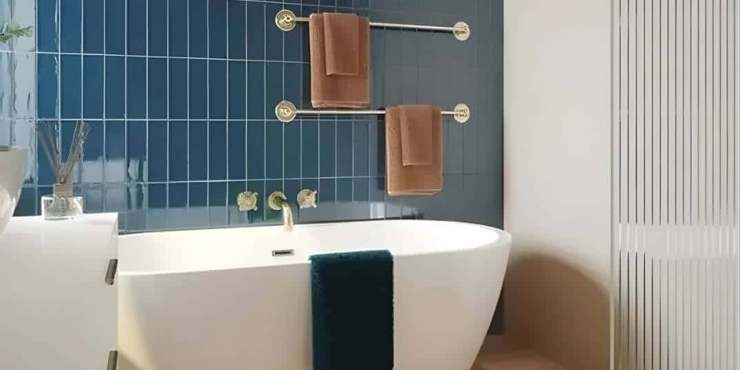
Deep Navy: The Case for Full Commitment
Navy blue bathroom tiles occupy the most dramatic end of the blue spectrum — and they are among the most consistently satisfying choices when used with genuine commitment rather than hesitation.
The mistake most homeowners make with navy is treating it as an accent rather than a primary material. A single navy feature wall in a bathroom otherwise finished in white or grey often reads as underresolved — a gesture toward boldness rather than a design decision. Navy works best when it is given real presence: floor-to-ceiling on two or three walls, or used to wrap a shower enclosure completely, or applied throughout a small cloakroom or WC where the immersive quality of a deep colour becomes an asset rather than a risk.
In smaller bathroom tile sizes — 75×150mm elongated brick, 100×100mm square ceramic, or the increasingly popular 65×265mm format — navy develops a textural quality through grout line rhythm that large format tiles cannot replicate. The colour shifts slightly between individual tiles, the grout lines create movement, and the overall surface reads as rich and considered rather than flat.
For hardware, brushed or satin brass is the most reliable pairing with navy blue bathroom tiles. The warm metal tone cuts through the depth of the colour without competing with it. Polished chrome, by contrast, reads as cold against deep blue — it highlights the coolness of the tile rather than balancing it.
Pale Blue and Powder Tones: Light Without Fragility
Pale blue bathroom tiles carry the highest risk of looking underdone — and the highest reward when they’re right. The difference between a powder blue bathroom that feels considered and one that feels dated lies almost entirely in the undertone and finish of the tile.
A powder blue with a grey undertone sits confidently in cool-light environments — north-facing bathrooms, windowless spaces with cool LED lighting — where warmer colours would feel discordant. A pale blue with a green undertone (duck egg, soft aqua) brings warmth that counteracts cool light and reads as fresher and more contemporary than classic powder blue.
Finish matters equally. A high-gloss pale blue tile maximises light reflection — particularly valuable in bathrooms where artificial light is doing the majority of the work. A matte pale blue in a low-light bathroom can feel flat and somewhat lifeless. Satin and semi-polished finishes represent a reliable middle ground: enough reflectivity to open the space, low enough sheen to avoid the maintenance burden of full gloss in hard-water areas across much of England.
In terms of bathroom tile sizes, pale blue in a 300×600mm or 600×600mm format on walls delivers a calm, contemporary result. The same pale blue in a small 75×150mm metro tile reads as more playful and domestic — well-suited to a family bathroom, less so for a principal bathroom where a more composed quality is the objective.
Coastal and Aqua Tones: Mood Without Narrative
There is a version of coastal bathroom design that has been done badly so many times it has become a shorthand for lazy interior decoration — rope detailing, shell accessories, anchor motifs, and a tile colour that exists in the same register as a faded beach towel. That is not what considered coastal blue bathroom tiles look like.
The well-executed coastal bathroom uses soft aqua, sky blue, and pale turquoise tile tones to evoke a feeling — light, space, the peripheral sensation of proximity to water — without any literal coastal reference. The tile does the atmospheric work. Everything else in the room stays quiet.
Soft aqua and sky blue tiles in a simple 200×200mm square or 300×600mm brick format, with white sanitaryware and natural timber or rattan accessories, produce exactly this quality. The colour is the feature. The hardware, the storage, and the accessories serve it without competing. This is the version of coastal blue bathroom design that works equally well in a Cornish cottage and a Manchester apartment — because it references a feeling rather than a geography.
Mixing Blue Tones: The Rules That Actually Matter
Using two different blue tile tones in the same bathroom — a common approach in 2026 UK bathroom design — is a strategy that rewards planning and punishes guesswork.
The most dependable approach: keep both tones within the same colour temperature. Two blues with warm undertones (teal and duck egg, cobalt and navy) work together because they share a tonal relationship. Two blues from opposite ends of the warm-cool spectrum — a purple-toned indigo alongside a green-toned aqua, for example — create a visual tension that reads as unresolved rather than layered.
The most successful two-tone blue bathroom schemes in current UK design use a deeper shade on the floor and a lighter shade on the walls — grounding the room with colour weight at floor level while opening the upper half of the space. A deep navy 300×600mm floor tile (with verified R10 slip resistance for wet areas) against a soft powder blue 300×600mm wall tile creates a scheme with genuine depth and spatial intelligence.
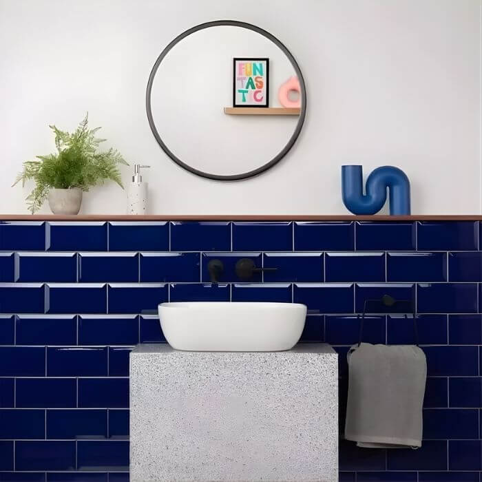
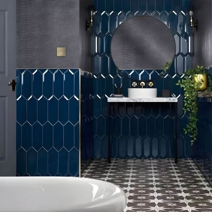
Cobalt and Mid-Blue: Intensity With Flexibility
Between the deep end of navy and the lighter coastal tones sits a range of mid-depth blue bathroom tiles — cobalt, sapphire, Prussian blue, inky teal-adjacent blues — that offer strong colour presence without the full commitment of near-black navy.
These shades perform particularly well in glazed ceramic formats where the glaze itself carries depth and surface variation. A cobalt glazed wall tile in a 150×150mm square or zellige-inspired format shifts between brighter and deeper depending on the angle of light — more saturated in direct light, deeper and more complex in shadow. This movement is what distinguishes a well-specified mid-blue tile from a flat printed equivalent.
Grout colour makes an outsized difference in this part of the blue tile spectrum. White grout with a cobalt tile creates a graphic, high-contrast grid that reads as energetic — the visual language of Portuguese and Spanish architectural tiling. A blue-toned grout closely matched to the tile produces a more immersive, colour-forward surface. Both are intentional decisions with genuinely different outcomes. What should never happen is a grout colour chosen from the sample card without considering how it changes the character of the finished wall.
Practical Maintenance Considerations
Deep blue bathroom tiles — navy, cobalt, and saturated mid-tones — show limescale, water marks, and soap residue more clearly than pale or neutral tiles. This is a daily reality for homeowners in hard-water regions, which covers most of London, the South East, East Anglia, and the East Midlands.
A satin or semi-polished finish manages this more practically than high gloss in darker blue tiles — enough sheen to look intentional, low enough to reduce the visibility of mineral deposits between cleaning sessions. Alternatively, factor a quality limescale remover into your bathroom maintenance routine from the outset rather than discovering the problem six months after installation.
The Blue Bathroom Tile Decision
The shade of blue that works in your bathroom is determined by three variables in sequence: your light conditions, your hardware and accessory choices, and your personal tolerance for a colour that makes a statement.
What blue bathroom tiles offer — across the full range from deep navy to pale coastal aqua — is a quality that genuinely neutral tile choices cannot replicate: a room that appears to have been designed around a specific intention. That quality is worth the additional care the specification requires.
Test at least three blue tile samples on your actual bathroom wall, under both morning daylight and evening artificial light, before ordering. Blue is the most light-sensitive colour in the tile palette — what reads correctly in a supplier’s lighting may read entirely differently in yours.