

Few floor patterns carry the architectural authority of a well-executed checkerboard. It appeared in the great houses of seventeenth-century England, spread through Victorian civic buildings, settled into Edwardian domestic bathrooms, and has been referenced by every subsequent generation of designers who understood that certain geometric arrangements are not trends — they are resolved ideas that keep proving themselves correct.
The checkerboard bathroom floor is having a pronounced moment in UK home renovation in 2026. But unlike the previous incarnations of this pattern that felt decorative and occasionally theme-driven, the best contemporary versions are grounded in proper traditional bathroom tile specification — the right formats, the right materials, the right grout width — and the results are bathrooms that look as though they have always been that way, in the best possible sense.
Why Checkerboard Works in Traditional Bathroom Design
The checkerboard pattern succeeds architecturally because it resolves the relationship between floor and room with a clarity that plain tiles or complex multicolour patterns rarely achieve. Two alternating tones — typically, though not exclusively, a light and a dark — create a grid that the eye reads as ordered and deliberate. The floor becomes a considered element rather than a background.
In UK period bathrooms — Victorian terraces, Edwardian semis, Georgian townhouses, and the significant proportion of inter-war housing stock that still carries original architectural detail — traditional bathroom tiles in a checkerboard layout are contextually appropriate in a way that contemporary large-format porcelain is not. The pattern references the same material vocabulary as the building itself: geometric, handcrafted-influenced, designed to last rather than to impress briefly.
This architectural coherence is precisely why checkerboard floors, when specified correctly, add rather than subtract from the value and character of UK period properties.
Traditional Bathroom Tile Formats for Checkerboard Floors
The format of the tile determines almost everything about how a checkerboard floor reads in a room — its sense of scale, its relationship to the period of the building, and its practical performance over years of daily use.
150×150mm (6×6 inch) square ceramic. The most historically authentic format for Victorian and Edwardian bathroom checkerboard floors. At this size, the pattern creates sufficient visual rhythm without overwhelming a compact bathroom floor — which, in the majority of UK terraced houses, runs between 3m² and 6m². This is the format that period restoration specialists reach for first, and with good reason: it is proportionally correct for the scale of most Victorian bathroom floors and reads as genuinely of its era rather than as a reference to it.
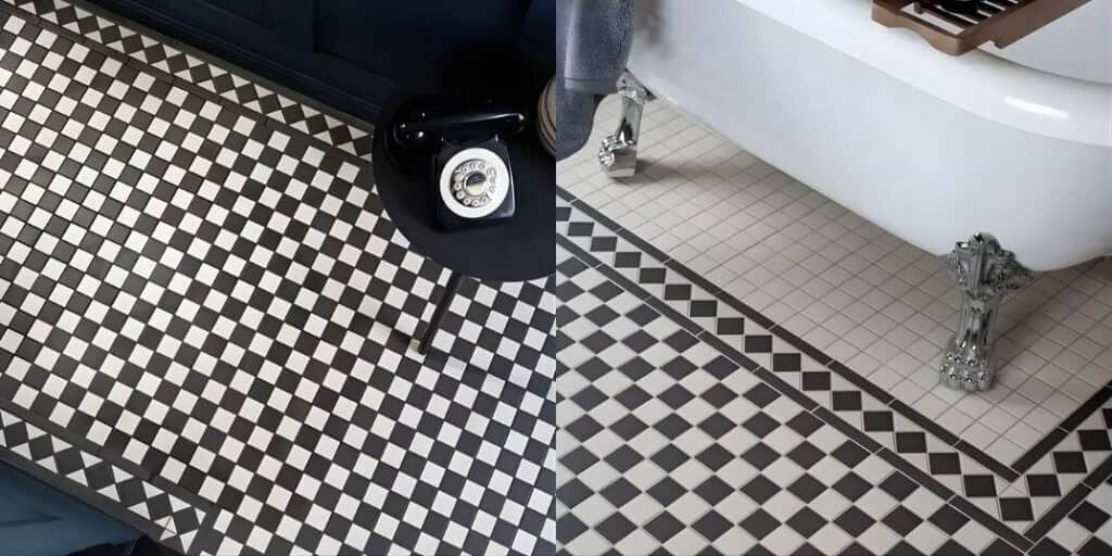
100×100mm (4×4 inch) square. A smaller format that produces a tighter checkerboard grid — appropriate for very compact Victorian cloakrooms, narrow galley bathrooms, and period WCs where the reduced scale of the space benefits from a proportionally smaller tile. At this size, the pattern adds detail and visual interest without competing with the room’s architectural elements.
200×200mm square. A larger format that suits the more generous bathroom proportions found in Georgian and larger Victorian properties — principal bathrooms in four-storey townhouses, first-floor bathrooms with ceiling heights of 2.7m or above. At 200mm, the checkerboard pattern carries enough visual weight for a larger floor area without the tile reading as disproportionately large for a domestic bathroom.
Encaustic cement tiles. The most decorative end of the traditional bathroom tile spectrum. Hydraulically pressed cement tiles with pigmented surfaces — available in classic black and white, but also in green and white, blue and white, and terracotta and cream combinations — produce checkerboard floors of genuine artisanal quality. They require sealing before installation and periodic re-sealing throughout their life, but they develop a natural patina with age that porcelain and ceramic cannot replicate. In the right property context, they are the most architecturally distinguished checkerboard option available.
Colour Beyond Black and White
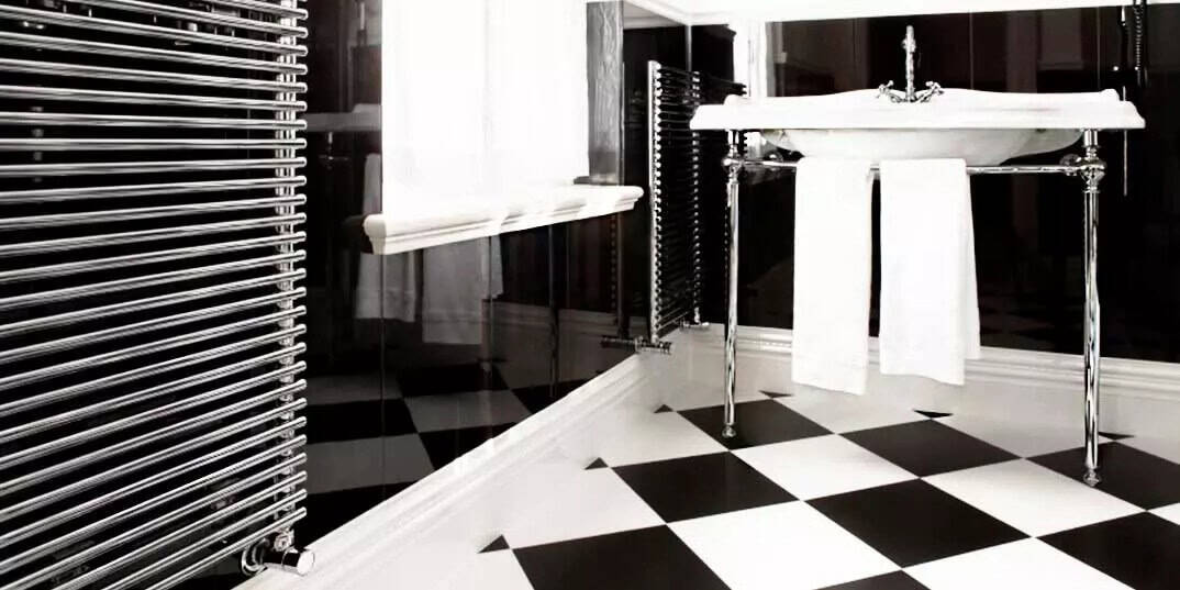
The black and white checkerboard is the canonical version — and it remains the most powerful for good reason. The maximum tonal contrast between alternating tiles produces a floor with strong visual presence that reads clearly across the full range of bathroom sizes and lighting conditions.
But traditional bathroom tile checkerboard floors are not limited to this combination, and some of the most successful contemporary interpretations move away from it deliberately.
Charcoal and warm white. Softening the contrast from black-and-white to charcoal-and-warm-white brings the pattern into closer relationship with the warmer neutral palettes dominating UK bathroom design in 2026. The geometric clarity of the checkerboard is maintained; the harshness of maximum contrast is reduced. This version suits bathrooms where the overall scheme is warm and organic rather than graphic and architectural.
Navy and cream. A combination with strong historical precedent in British interior design — referencing Delftware tile traditions and the blue-and-white palette of Georgian decorative ceramics. Against warm timber vanity units and aged brass hardware, a navy and cream checkerboard floor carries a quality that feels specifically British rather than generically period.
Forest green and white. One of the more striking traditional bathroom tile checkerboard combinations gaining ground in UK bathroom renovation. The warmth of a deep forest green tile alternating with a clean white produces a floor with genuine character — particularly effective in Victorian bathrooms with original cast-iron roll-top baths and period sanitaryware.
Terracotta and black. A combination that references Mediterranean and Southern European tile traditions while sitting comfortably within the broader terracotta-inflected colour direction of 2026 UK interior design. Warmer, more organic than the classic black and white, and particularly well-suited to UK farmhouses and rural properties where the earthy tone of terracotta is architecturally coherent.
Grout: The Specification That Makes or Breaks a Checkerboard
In most tile specifications, grout is a supporting decision. In a checkerboard floor, it is a primary one — because the grout line is the visual element that defines where one tile ends and the next begins, and the width and colour of that joint changes the character of the finished floor substantially.
White grout with a black and white checkerboard emphasises the grid pattern, making the geometric structure of the floor the dominant visual element. This is the most graphic, highest-contrast version of the pattern — appropriate for bathrooms where architectural boldness is the objective.
Mid-grey grout softens the junction between black and white tiles, reducing the visual sharpness of the pattern boundary. The checkerboard reads as a floor with tonal variation rather than a geometric statement — a subtler result that suits bathrooms where the floor is intended to complement the room rather than lead it.
Tone-matched grout — grout colour calibrated to match one of the two tile tones — produces an interesting asymmetry where the grout visually aligns with one tile and creates contrast against the other. With a black and white checkerboard and a white grout, the white tiles and grout read as a continuous field punctuated by black squares — a very different result from the same tiles with a grey joint. This effect is worth testing with physical samples before committing to a grout specification.
Grout joint width for traditional bathroom tile checkerboard floors in ceramic or porcelain should run between 3mm and 5mm — wider than the tight joints appropriate to rectified large-format tiles, and consistent with the slightly less precise dimensional tolerances of traditional ceramic formats. Encaustic cement tiles typically require 4–6mm joints to accommodate natural dimensional variation between individual tiles.
Installation Considerations for Checkerboard Floors
A checkerboard pattern requires more careful installation planning than a simple straight lay, and this should be factored into both labour cost and project timeline.
Centring the pattern. The starting point of a checkerboard layout is critical to how the finished floor reads. The pattern must be centred on the room’s visual axis — typically aligned with the door opening, the centrepoint of a freestanding bath, or the centreline of the basin — so that cuts at the perimeter walls are equal on opposite sides. An off-centre checkerboard with unequal border cuts reads as a layout error rather than a deliberate design choice. Your tiler should dry-lay the full floor plan before fixing any tiles.
Border tiles. Traditional bathroom tile checkerboard floors historically incorporated a border — a single row of one tile colour running continuously around the perimeter of the floor, separating the main checkerboard field from the skirting. This detail references Victorian and Edwardian tile laying traditions and significantly improves the visual resolution of the finished floor. Without a border, the pattern can read as abruptly terminated at the wall junction. Even a single-tile-width border in the darker of the two checkerboard colours adds an architectural finish that distinguishes a well-specified floor from a basic pattern tile.
Subfloor preparation. Checkerboard floors in smaller tile formats — 100×100mm and 150×150mm — are more forgiving of minor subfloor imperfections than large-format tiles, but the substrate must still be fully bonded, level, and rigid. Any flex in the subfloor will work adhesive bonds loose over time — a particular consideration in older UK properties with timber joisted floors where some movement may be present. A rigid tile backer board over existing timber subfloors is the correct preparation before tiling, regardless of tile format.
Walls With a Checkerboard Floor: Keeping the Room Balanced
A checkerboard floor carries considerable visual energy. The wall tile specification needs to work with this rather than compete against it.
The most reliable approach is a plain, single-colour wall tile in a format and tone that reads as quiet beside the floor pattern. A classic white or warm cream metro tile — 75×150mm or 100×200mm — in a simple horizontal brick lay provides a traditional context for the checkerboard floor without adding further pattern complexity. The wall tile references the same traditional ceramic vocabulary as the floor while remaining clearly subordinate to it.
For homeowners drawn to more decorative wall tile choices, a plain gloss white ceramic in a larger format — 200×400mm — simplifies the wall surface sufficiently to allow the checkerboard floor the visual prominence it deserves. Avoid patterned or multicolour wall tiles in any bathroom where the floor is a checkerboard — the two patterns will compete rather than complement.
Checkerboard Floors in UK Property and Resale Context
Traditional bathroom tile checkerboard floors add measurable character and period authenticity to UK properties where the architectural context supports them. In Victorian, Edwardian, and Georgian properties, they are among the most commercially positive tile decisions a homeowner can make — appealing to buyers who value period detail, photographing compellingly in estate agent imagery, and requiring no explanation of why they were chosen.
In contemporary new-builds or properties without period architectural detail, the checkerboard reads differently — as a decorative choice rather than an architectural one. This doesn’t make it wrong, but it changes the design work required to make it feel resolved rather than imposed. In these contexts, the smaller format and a softer colour combination — charcoal and warm white rather than black and white — typically integrates more naturally with the existing character of the building.
The Enduring Logic of the Checkerboard
Traditional bathroom tile checkerboard floors endure not because they keep returning to fashion but because they were never entirely absent. Designers who understand geometric pattern have continued to specify them across every trend cycle precisely because the pattern’s underlying logic — tonal contrast, geometric order, material quality — does not depend on any particular moment in design history to justify itself.
Specified correctly, with the right format for the room’s proportions, the right colour combination for the property’s character, and the grout decision made as deliberately as the tile selection, a checkerboard bathroom floor will look as considered in 2046 as it does on installation day.
That is the quality that genuinely traditional bathroom tiles have always offered — and continue to deliver.
Always dry-lay your checkerboard tile pattern before committing to adhesive — centring the pattern correctly and assessing the border cut width at all four walls is the single most important installation step for a floor that reads as professionally resolved.